
Aquazone / identity
Aquazone is Mexico’s main competitive swimming suit and accessory brand. For over three years, I created a myriad of designs and packaging for them, including catalogs, logos, websites, swimming caps, manuals, posters, signage, and more.
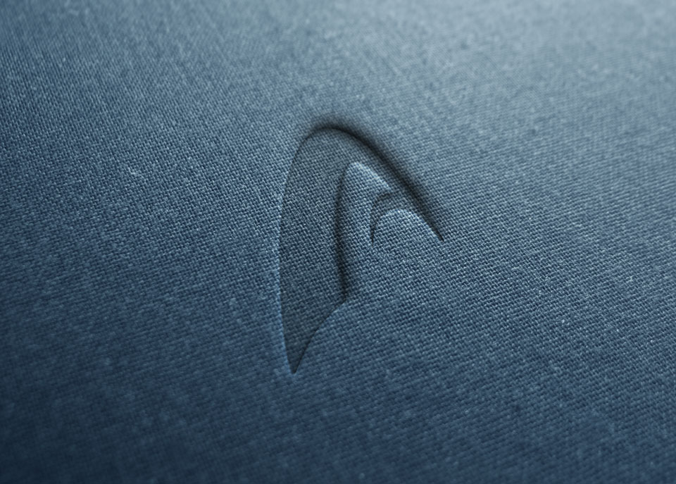
This symbol was designed to be used in conjunction with their old isotype. The shape suggests the letter A, while the negative area depicts a shark’s head and fin revealing the brand’s spirit to stay at the top of the food chain.
- Categories: Identity / Illustration / Logo / Print / Retouching / UI
- Client: Aquazone